30 May 2011

Pointed Pen Calligraphy


I have recently finished up a wedding envelope project. This script is based on the Young Baroque script font. It was written in sumi ink with a Leonardt Principal nib. 

23 May 2011

Sinker Cypress and Dinky Dips


This is my custom designed dinky dip holder. It is one of my favorite accessory tools. Of course, the dinky dips are indispensable for pointed pen calligraphy. You can find them at John Neal Booksellers or Paper and Ink Arts. There is a holder that you can purchase also. But I wanted to kick it up a notch and make my own.

This dinky dip holder was made from a piece of sinker cypress that was pulled from the south Louisiana bayous by my cousin, Dennis Guy. He is a wonderfully interesting man that lives and works in the bayou country.

If you would be interested in a custom dinky dip for yourself, please contact me.

15 May 2011

Trachouse Logo Sketches

Recently, I have been working on a logo and artwork project for Trachouse.com. They will be launching the new look of their guitar pedals sometime in June 2011.  David Aucoin is a very talented musician and creates some of the best guitar pedals on the market.

Below are some of the early conceptual sketches.


These were then imported into illustrator and cleaned up slightly.


From here the client and I can talk about which look is heading toward their vision. 
The logo that was chosen is not shown here so as not to spoil the launching of their new look.

09 May 2011

Pointed Asymmetrical Italic influenced by Denis Brown

My adventure in calligraphy has really just begun. I received my first holder and nib for Christmas 2007. That pen holder and nib came from John Neal Booksellers. My husband did a great job to find one of the best suppliers for calligraphy essentials without knowing anything about the calligraphy world. Since then I have immersed myself in finding all I can on the subject. 
What a beautiful world I found on my journey!

My latest study tool has been the online lessons from Denis Brown. These are a treasure trove of instruction and information. Denis is teaching a compressed, extreme asymmetric version of italic. The class is wonderful in the fact that you can go back and view the lessons as many times as you like, pausing and rewinding wherever needed. There are two modules published already (over 4 hours of instruction already!) with two more to come. This is definitely worth the small cost. 

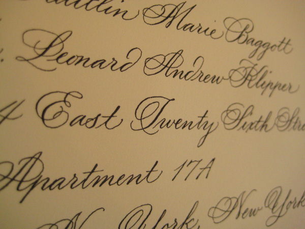
I have been practicing whenever I can. The piece shown below was done in my style of Denis' instruction. It is painted with sumi and walnut ink on a full sheet of Arches MBM paper.


This piece is for my church. Names will be written on the keys of the piano, sumi on the white keys and Dr. Martin's bleed proof white on the black keys. It will be a living piece as time goes on.